My final brochure came out exactly how I wanted it to! I wanted to keep everything simple and classy looking. I also wanted to make sure my brochure went well with my business card and letterhead. I wanted it to feel warm and inviting and make young adults want to go! I really liked using my own cupcake photographs as well, it makes me relate more to this brochure. I also think using the same font as "cupcakes & cocktails" makes everything go well together.
ACD - Digital Arts Blog
Monday, December 10, 2012
Letterhead
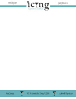
My final letterhead I wanted to make sure it went well with my business card. I kept the stripe out from Icing at the top and I wanted it to go together with the bottom stripe. I also kept it cohesive by using the little martini glass as place holders. I wanted to make sure my designs stayed simple and classy. I think they came out great!
Business Card
Above is my final business card. I am extremely happy with how it came out! I really like how my name matches the cupcakes & cocktails font and the martini glass is on both sides. I think they go really well together and look very classy. Icing is a business I wish I could open and share with everyone else! If I ever open this business one day I am all set with my business card!
Monday, December 3, 2012
Brochure Sketch
For my brochure I knew I wanted to use all my own cupcake pictures. I wanted to include pictures of as many cupcakes and cocktails as I could. I wanted the hours, location, and contact information to all be present on the brochure, as well as easy to find. I included the line around the entire brochure because it was similar to the letterhead I want to use. I also wanted to have a sample menu on the inside so the buyer could see what my business has to offer. On the inside there is also a coupon for the person to take into the bar to get a free cupcake, this is an incentive to try out my business and get people there!
Monday, November 19, 2012
Letterhead Mock Ups
For my letterhead mock ups I tried to stay consistent with my business cards. I wanted to use the same logo and colors for everything relating to my company. Each letterhead is slightly different because I made one then worked off of that one to form the next one. Some I think are too simple and some have too much going on. I wanted it to look simple but still classy and professional. I am still unsure which one is my favorite.
Thursday, November 15, 2012
Business Card Mock Ups
For my business cards I knew I wanted to use my original logo for my company. I tried using that logo on the front of the card. Then I started taking pieces out of the logo for the front to make it more simple or adding it to the back so it looks cohesive. I really like each of these cards. I wanted to make sure they looked professional but you could still see exactly what my company is about.
Company Questionnaire
1. What is your business?
--We are a business that is an upscale bar/lounge. We sell cupcakes and
cocktails together. The buyer can either purchase a preselected pair or
they can choose to put their own pair together.
2. Describe your business in one sentence.
-- It is a perfect place to relax with friends while enjoying drinks and a delicious unique cupcake too.
3. Who is your target audience?
-- The target audience for Icing is mainly young adults, mid to upper twenties who are looking for a fun, relaxing environment.
4. Who are your competitors?
-- Competitors for my business would be any cupcake bakeries as well as bars and lounges in the same area. Luckily there are not any current bars that offer cupcakes too!
5. What makes them better/worse than your product/service?
-- Cupcake bakeries may have a little advantage because they can sell to all ages where my business as well as bars can only offer products to 21+ because of the drinks. But my company is better than most bars because I do offer a little dessert for those who have a sweet tooth.
6. Do you currently have an identity?
-- No we do not.
7. How do you want your image to be seen in two years?
-- I want to be the business that everyone wants to go to and wants to be at. I hope that I have a company that is always being talked about!
8. If your company was an animal, what animal would it be and why?
-- If my company was an animal it would be a monkey because they like to "hang out" and get crazy.
9. If your company was a person, who would it be and why?
-- If my company was a person it would be anyone who was over 21 so they could come and enjoy themselves at Icing.
10. If your company was an object, what would it be and why?
-- It would be a martini or margarita glass with a floating cupcake, to represent what the company is.
11. If your customer was a cartoon, who would it be and why?
-- If my customer was a cartoon it would be Minnie Mouse because she is a classy woman who likes to enjoy herself.
Subscribe to:
Posts (Atom)


